Every business gets its own world.

Sample designs for a hair salon, a restaurant, an electrical firm, a wellness studio, a physio practice and a bakery. Each one is built around how that business wins customers.

Get my free preview

Every design, up close

Sample designs, not client projects. Names and texts inside them are made up for the sample.
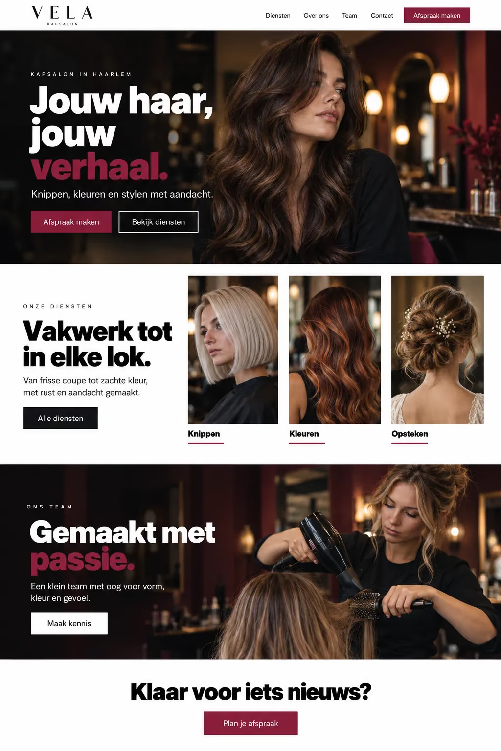
  1. Sample design: VELA (hair salon) homepageSample designView the whole page

    Hair salon

    VELA

    Booking an appointment should take one tap.

    Why it looks like this
    1. Booking in two places The appointment button sits in the menu and right under the headline.
    2. Services as pictures Cutting, colouring and styling each get a photo, so visitors see the result first.
    3. Dark and warm Deep tones and portrait photos make it feel like this salon, not a template.
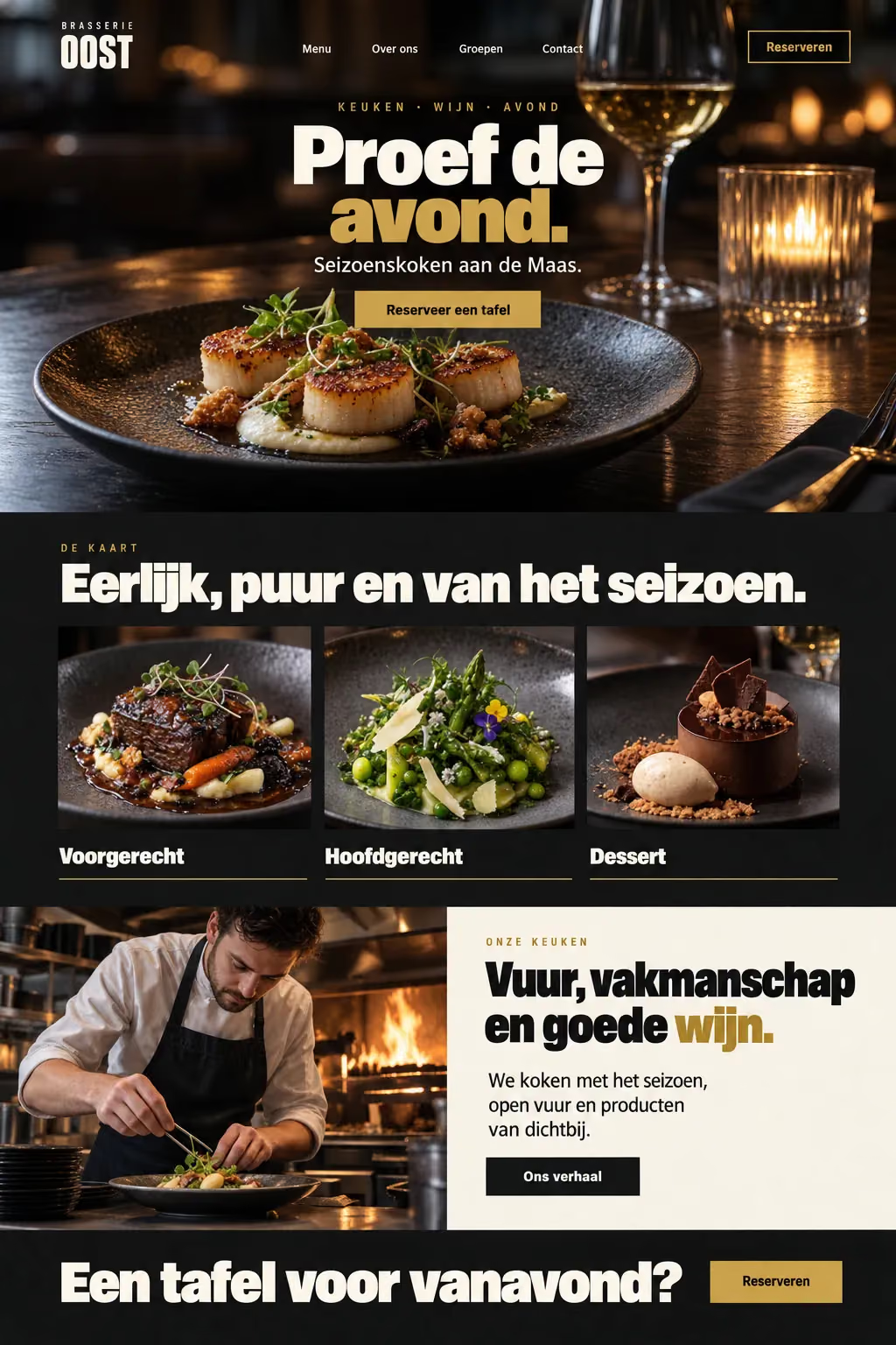
  2. Sample design: OOST (restaurant) homepageSample designView the whole page

    Restaurant

    OOST

    Sell the evening before the first visit.

    Why it looks like this
    1. Mood first A dark page with candlelit food photos sells the evening, not just the menu.
    2. Reservations always in reach The reserve button stays in the top corner on every screen.
    3. The menu in three courses Starter, main and dessert as three pictures, easy to browse on a phone.
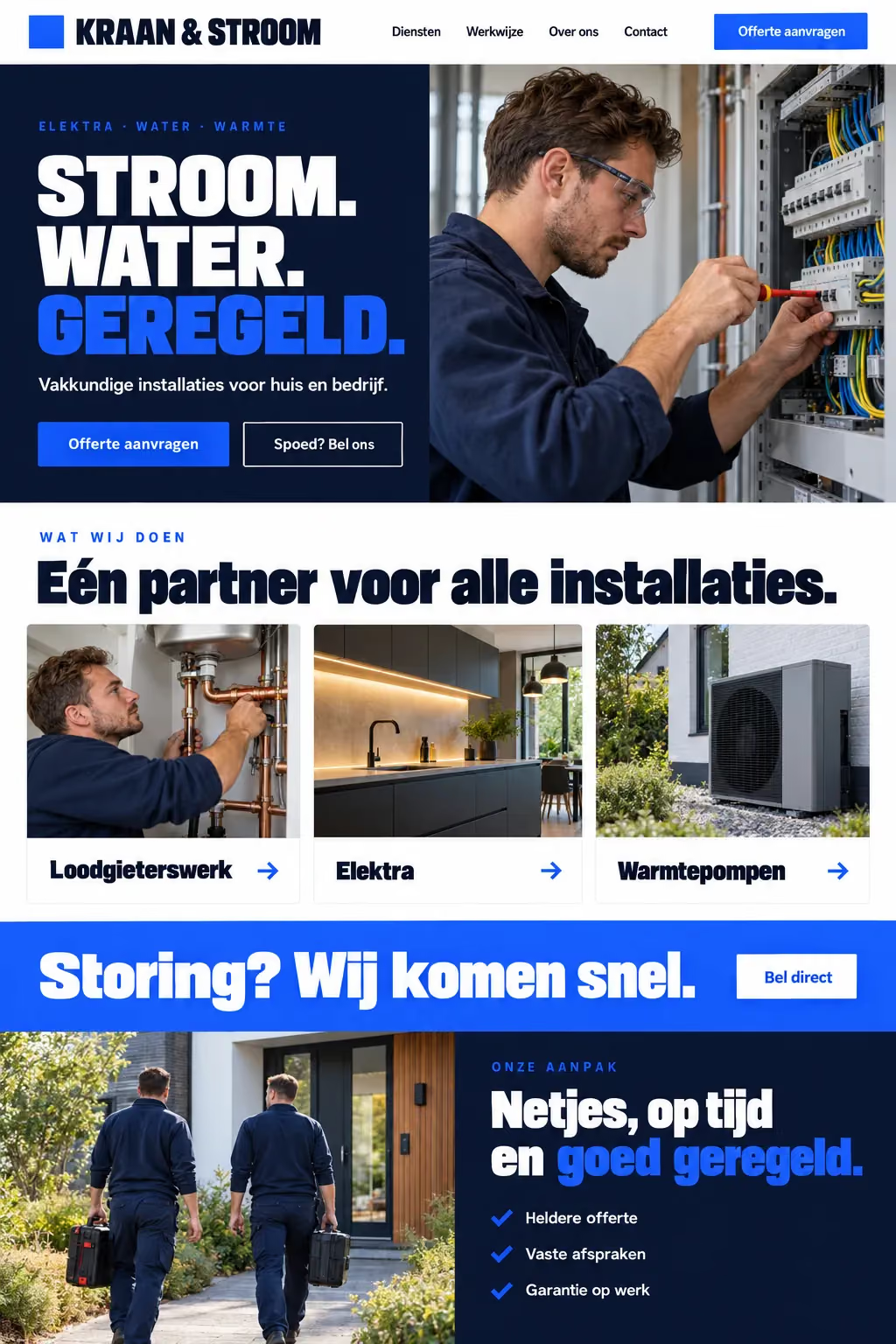
  3. Sample design: Kraan & Stroom (electrical firm) homepageSample designView the whole page

    Electrical firm

    Kraan & Stroom

    Say what you do in three words.

    Why it looks like this
    1. One clear promise “Power. Water. Sorted.” tells visitors what the business does at a glance.
    2. An emergency line A bright band for urgent faults with a call button, for the visitor in a hurry.
    3. Find the right service fast Plumbing, electrics and heat pumps each get their own card and page.
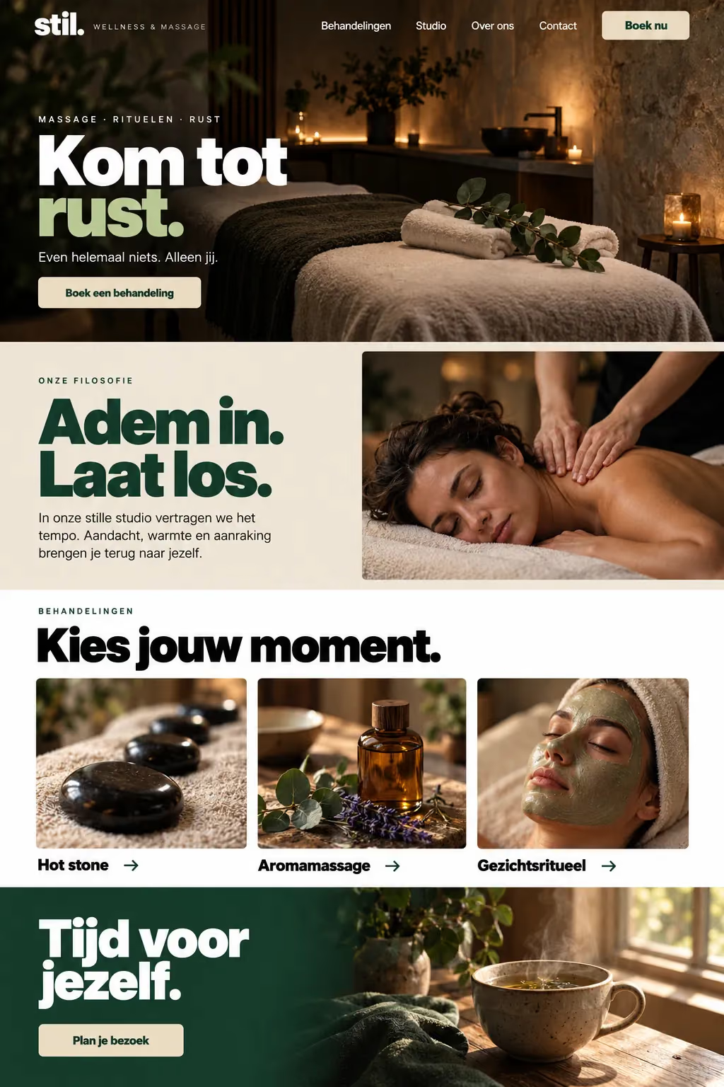
  4. Sample design: stil. (wellness studio) homepageSample designView the whole page

    Wellness studio

    stil.

    Calm, with one clear invitation.

    Why it looks like this
    1. A slower pace Soft dark tones and plenty of room set a quieter pace than a sales page.
    2. Treatments as moments Hot stone, aroma massage and facial ritual, each with its own photo.
    3. One calm button Booking a treatment is the only strong action, repeated in the header.
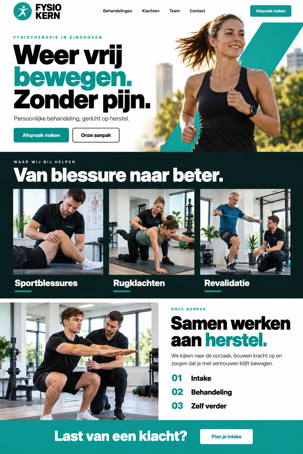
  5. Sample design: Fysio Kern (physio practice) homepageSample designView the whole page

    Physio practice

    Fysio Kern

    Speak to the pain, then offer the way out.

    Why it looks like this
    1. A headline about the patient “Move freely again. Without pain.” starts with what the visitor wants.
    2. Find your complaint Sports injuries, back pain and rehab, each with a photo, so visitors find their case.
    3. Appointment in the header One teal button for an appointment, visible on every screen.
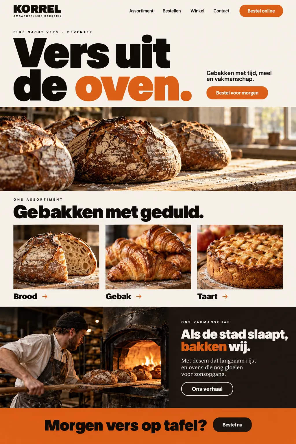
  6. Sample design: Korrel (bakery) homepageSample designView the whole page

    Bakery

    Korrel

    Place tomorrow’s order today.

    Why it looks like this
    1. A huge headline “Fresh from the oven.” in big type, with one word in the bakery’s orange.
    2. Order for tomorrow The order button sits next to the headline and comes back in the closing band.
    3. The range in three Bread, pastries and pies as three pictures, one tap to each.

Sample design

The next one could be yours.

Tell me about your business and get a free, personalised preview within 48 hours.

Usually I reply within 24h.